
Rue Magazine Feature:Crafted in Contrast
We’re pleased to share that Together Home Design Studio was featured in the Fall 2025 issue of Rue Magazine, highlighting a San Francisco home renovation shaped by the balance of light and dark, original architecture and modern living.
Located in Noe Valley, the four-bedroom, four-bathroom home was on the verge of being taken down to the studs when we first encountered it. The goal was to preserve the character that made the house special while rethinking how its spaces could support the family living in it.
A Home Designed for Real Life
Our clients, a well-traveled family with three children, wanted a home that felt inviting, social, and refined. They loved entertaining, but they also needed spaces that worked for everyday family life. The initial scope centered on two front rooms whose purpose and relationship to one another felt unresolved.
Rather than approaching each room in isolation, we looked at how the spaces could work together while serving distinct functions.
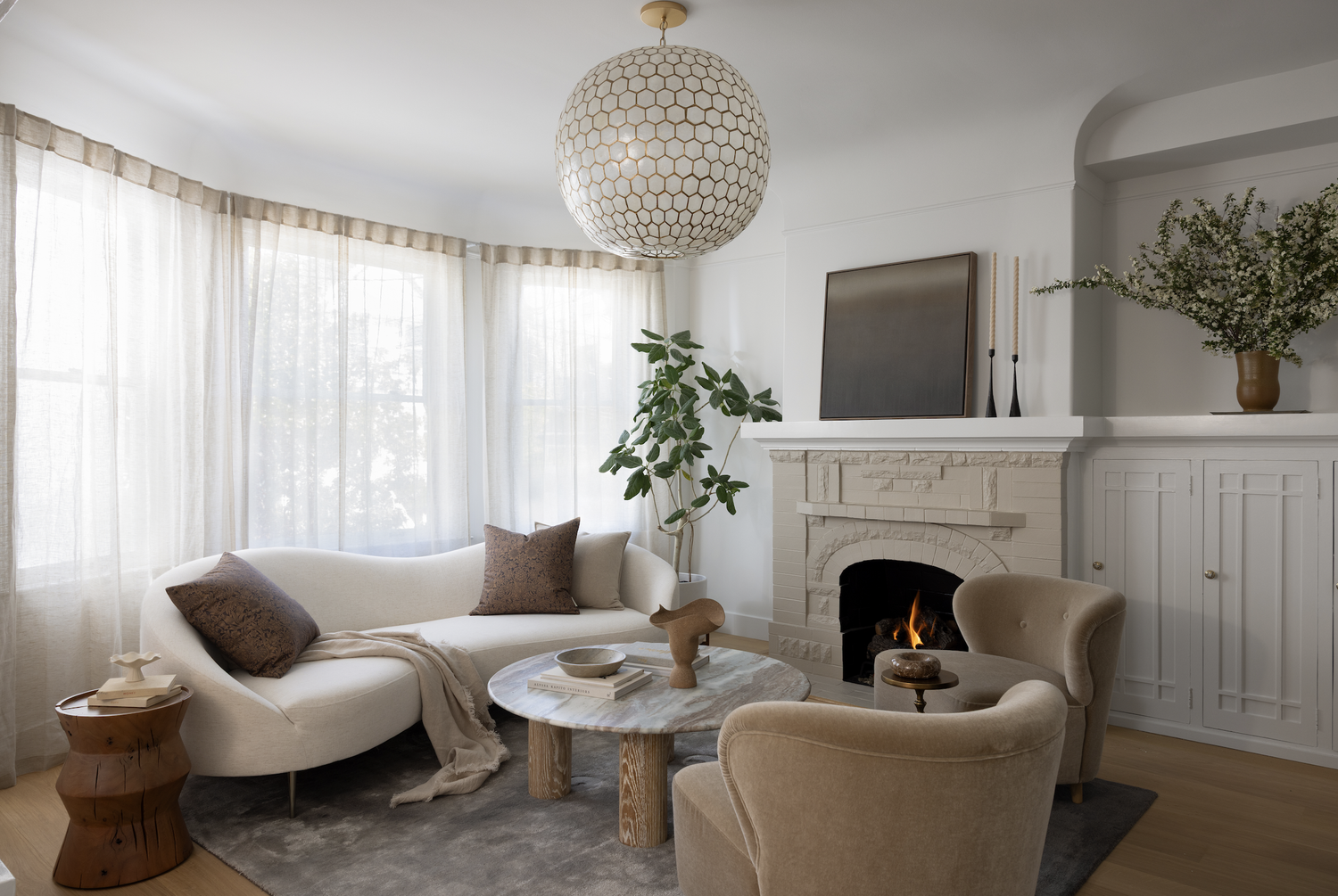
In the front living room, layered neutrals, tactile materials, and sculptural forms create a setting that feels soft, modern, and comfortable. A bouclé sofa, velvet chairs, natural wood, and sheer drapery bring depth without relying on bold color. Artwork above the fireplace is styled casually, reinforcing the idea that an elegant room can still feel relaxed.
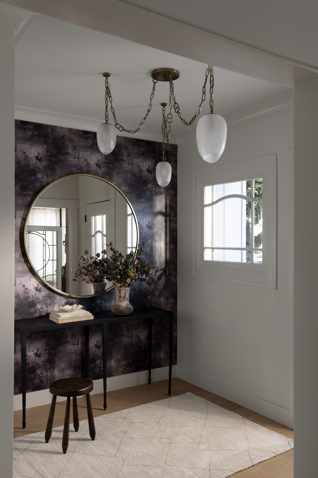
The entry introduces a more playful note. A mulberry-pink front door, expressive wallpaper, and a sculptural light fixture establish a sense of personality from the moment you walk in. The original coffered ceilings and stained-glass windows remain important parts of the home's identity, grounding the updated interiors in the architecture that was there from the beginning.
Finding the Balance Between Light and Dark
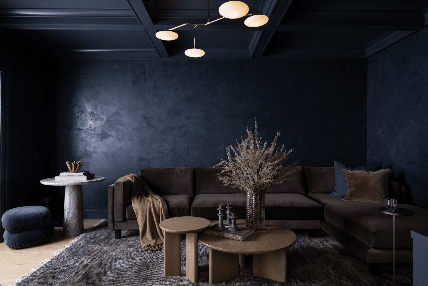
The second room takes a different direction. Without windows, the media room offered an opportunity to create something more intimate and atmospheric.
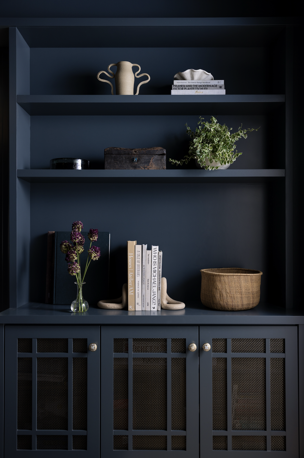
Deep blue walls, a rich velvet sofa, and a layered wool rug give the room a cocooned quality. Custom built-ins echo the home's original architectural character, while the generous seating accommodates everything from family movie nights to larger gatherings.
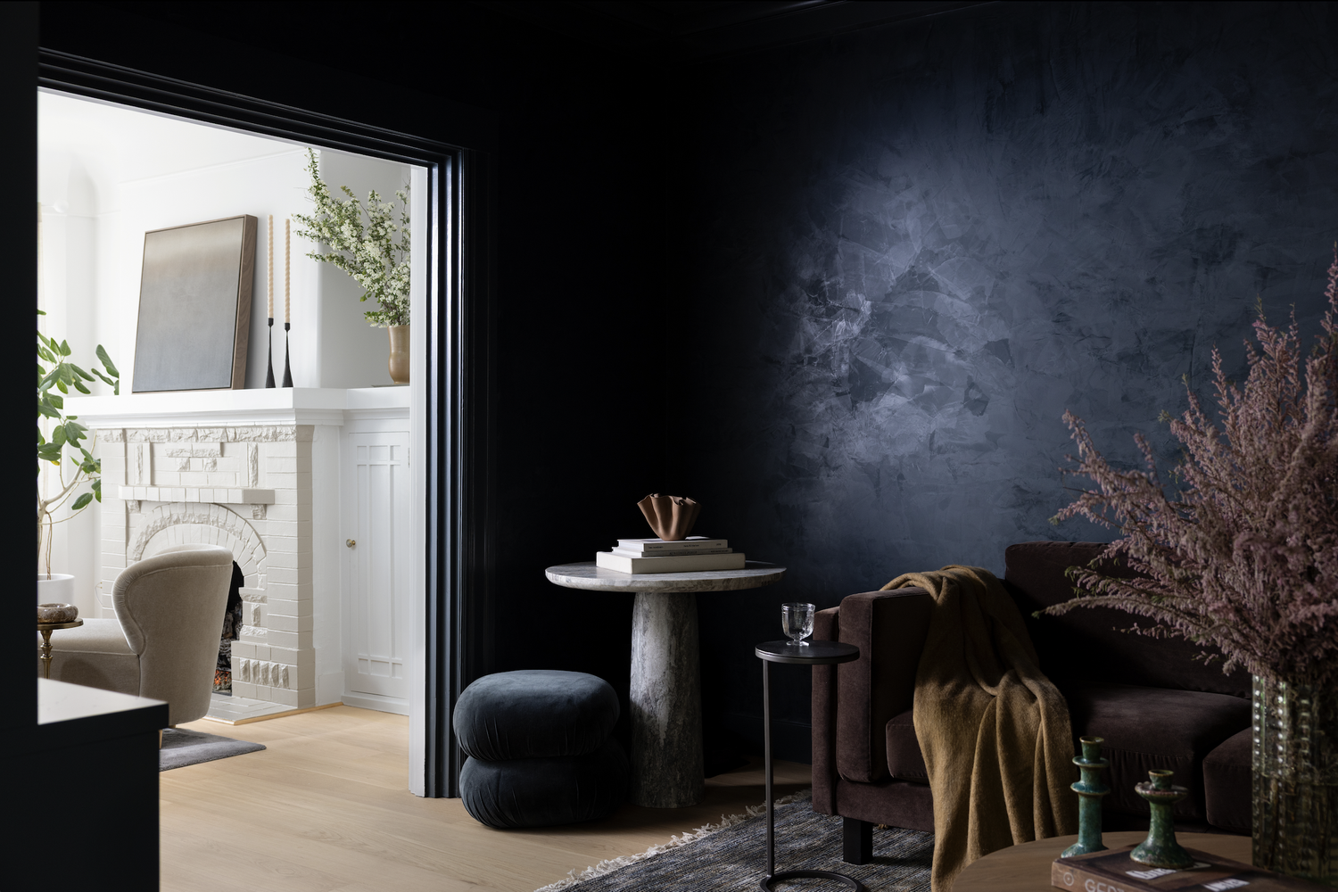
The contrast between the two rooms is intentional. One is light and textural; the other is dark and enveloping. Together, they create variety without losing cohesion.
As we shared with Rue Magazine, color, pattern, and texture are most effective when they work together to establish a feeling. The goal isn't to make a single statement in every room, but to consider how each decision contributes to the experience of the home as a whole.
Preserving Character, Making Room for Change
Throughout the renovation, the original architecture provided a foundation for the new design. The result balances the home's Victorian character with contemporary furnishings, considered materials, and spaces that better reflect the family's routines and relationships.
For us, successful design isn't about imposing a recognizable aesthetic. It's about understanding how clients want to live, identifying what matters most, and translating those priorities into a cohesive, functional home.
We're grateful to Rue Magazine for featuring this project and sharing the story behind it.
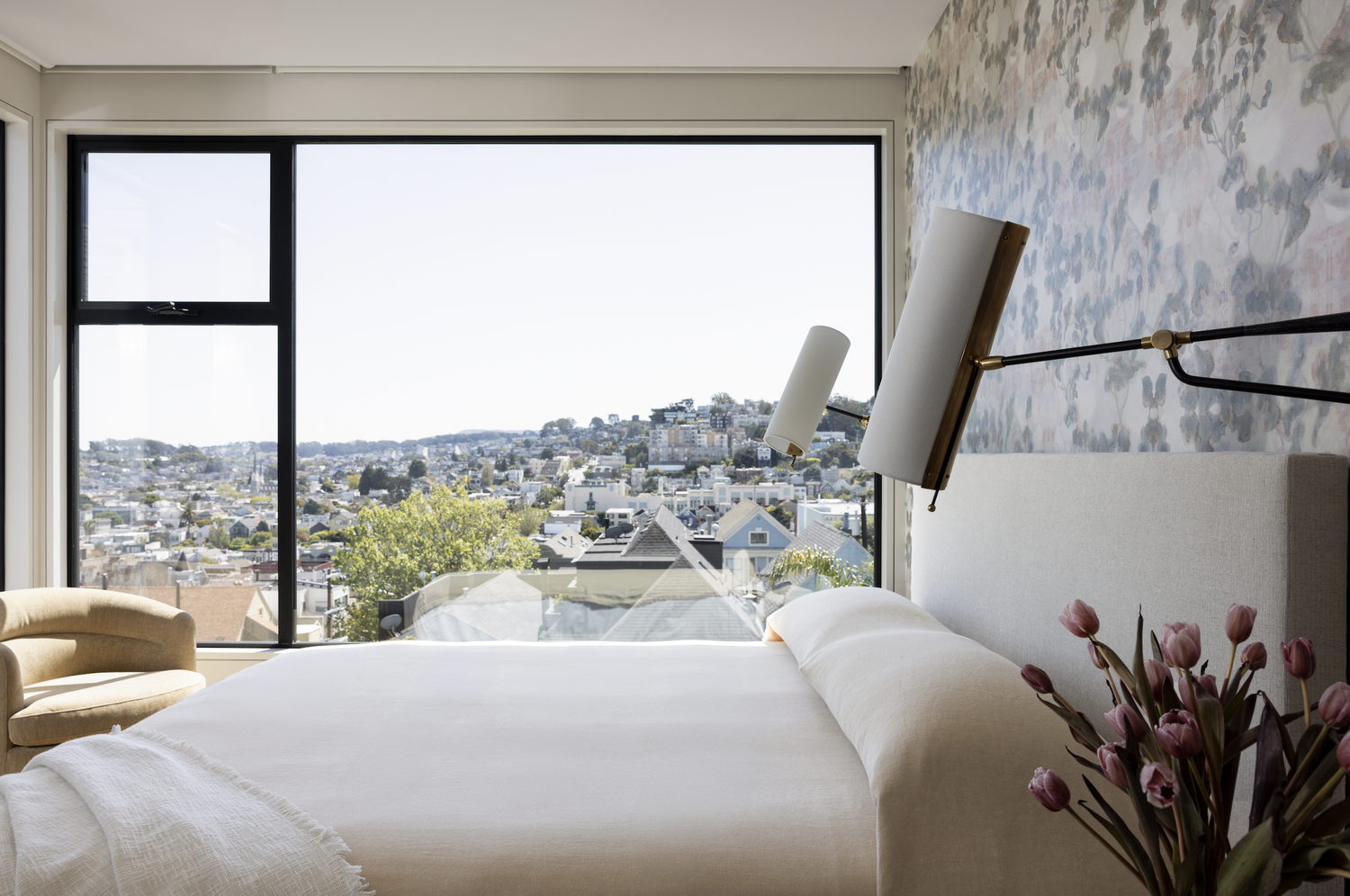
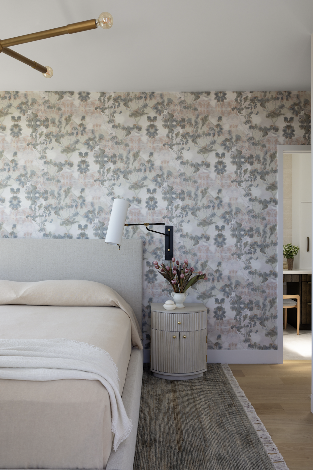
Read the full feature: Explore Crafted in Contrast in the Fall 2025 issue of Rue Magazine.
Interior design by Together Home Design Studio. Photography by Bess Friday. Styling by Beth Protass. Architecture by Blue Truck Studio. Builder: Cameron Home Builders.